6 Common Design Tips People Use Wrong
Often, when planning repairs, we rely on concepts that seem unshakable to us: they say, white walls visually increase the space, and a large pattern on the wallpaper, on the contrary, reduces it. In fact, this is not entirely true. And some of these cliches need, if not revision, then semantic adjustment.
1. Paint the walls in light colors to expand the space
Indeed, light colors make the room brighter, due to which the feeling of "air and volume" is created. And if the ceiling and walls merge, then the space becomes "limitless" at all - which also has an expanding effect. But this does not mean at all that the walls should not have a shade at all.
When choosing the color of the walls for a small room, remember that light, pastel colors and snow-white white are good in sun-drenched, and most importantly, not too small rooms, and in a miniature room with such a technique you will only achieve the feeling of "I want to go home." To avoid this, add color to the light interior.
A bright accent wall, on the other hand, will add depth, and contrasting details will help improve room design without destroying the airiness.
Do not be afraid to use saturated colors: although they "eat up" the light, they add depth and respectability to the interior, making the room solid and cozy. Intimacy is not the same as crampedness. A light ceiling and floor, plinths, and platbands will be enough. To prevent the room from looking too dark, take care of additional sources of lighting.
By the way, a small room, painted in a dark color, together with the ceiling, looks very interesting. Such a room will not look light and spacious, but it will not seem cramped either. The dark color of the walls is especially good in private areas - bedrooms, offices - it softly envelops and relaxes.
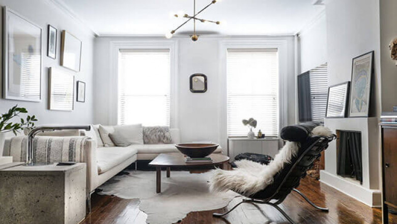
2. To hide the cramped space, choose furniture in the same range as the walls
The logic is simple: furniture that merges with the walls is not conspicuous. You've probably seen such almost monochrome interiors, where instead of a sofa - only its shadow, instead of a bed - its outline. Yes, pure white (or blue) rooms look good in the picture, especially small ones. But by "dissolving" all the furniture, we get an interior in which the eye has nothing to cling to.
Use the reception in dosage. "Dissolve" only bulky and functional furniture, for example, a wardrobe or a bed, and define the role of "nails" for smaller, light elements. A bright armchair or bedside table, a contrasting floor lamp or chair will catch the eye and make you forget about the surrounding cramped conditions.
Make sure that around such interior soloists (and there should not be more than two or three of them) there is enough space for perception, do not block the physical space. A picture, a panel or a colored spot on the wall can play the role of an accent. Do not be afraid of bright large forms even in a small room. If the rest of the interior is designed in light colors and in a minimalist style, an expressive accent will only add volume and depth.
If you think that choosing furniture to match the color of the walls is easy, then you are mistaken. Even white on different materials has its own shades.
Are you afraid of daring experiments? Then just add one extra-bright color to the monochrome interior to match the background. Let it be present in the upholstery of armchairs, textiles, accessories, and the interior will immediately become livelier and more cohesive. And, by the way, do not forget that furniture on legs looks easiest in small rooms.
3. Avoid large patterns in small spaces so as not to increase the effect of crowding
This rule is absolutely true when it comes to bright, multi-colored, dense drawings - they really "squeeze" the room, as they are directed towards the viewer. On the other hand, a small, close-fitting flower or a thin, but rich strip will also "eat up" the space. After all, the matter is not so much in the size of the picture, but in its density and multicolor.
A subtle graphic drawing, with rarely located elements, will give the interior more airiness and lightness than even a monochromatic painting: contrast here is a synonym for volume. The drawing does not have to be on a white background, a dark one will do. The main thing is the fineness of the lines, contrast, and spacing. Then the "air" between the elements of the print will enter the room.
All of the above also applies to striped wallpaper: wide contrasting stripes alternating light and dark tones will push the boundaries of the room, while wallpaper in a dense saturated strip without "air" will make it tighter.
4. Accent one wall to add depth to the interior.
If you want to have a beneficial effect on the visual perception of space, choose contrasting solutions. A strip next to a floral print of the same color may add some variety to the interior, but it will not affect the placement of accents and depth. The volume is created precisely by contrasting solutions: light walls - a dark accent, pale pastel - bright paint, a plain wall - a catchy pattern.
Think about which wall to accentuate. The desired effect depends not only on the pattern and color but also on the location of such a wall.
A dark accent wall will appear closer to the viewer. At the same time, the sidewalls, on the contrary, will visually move apart. This interesting optical effect works the other way too. A light accent wall against the background of densely colored walls seems to move away, pulling the space after it.
Other contrasts will work in the same way: warm, bright colors, saturated, dense patterns will bring the wall closer, and cool whitened tones, light subtle drawings or monochrome solutions will move away.
If in a narrow lightroom you highlight one of the long walls with color, the room will seem even narrower and longer. In this case, a narrow end wall located farther from the entrance should be dark. Often this role goes to a wall with a window, do not be confused by this. On the contrary, you can accentuate with curtains. If you want to highlight a long wall, choose an inversion - dark walls and a light accent.
Do not try to "load" the dedicated wall with functionality - it has a special purpose. Near such a wall, you can place one large piece of furniture (sofa, chest of drawers or bed), or put several small ones (chairs, cabinets, lamps), but make sure that there is a lot of free space around these items - it is important that they themselves are perceived as part decorative solution.
5. Hang a mirror to remove the blind wall effect
The mirror trick is a lifesaver for designers, but it can also fail. For example, if you place a growth mirror on the wall at the end of a long narrow corridor to let air into a closed, cramped room, you will get another problem: the corridor will visually become even narrower and longer.
In this case, place the mirrors correctly on long walls. Yes, it will be inconvenient to look in them, and there seems to be nothing to be reflected there, but if you supplement the composition with illumination, the mirror on the wall will reflect the light, and the space as a whole will become more voluminous and lighter.
Consider what exactly your mirror will reflect. It is bad if there is a dusty corner or a blank wall, it is good if there is a light source (including a window) and most of the room's space.
6. Use glossy surfaces to brighten the room
Gloss reflects light, multiplies glare, and adds volume to the space. But his shortcomings are "mirror": the space becomes "colder".
Balance glossy surfaces with warm matte textures to avoid unwanted effects. Natural wood textures work well as a visual "insulation". An interesting and unobtrusive contrast turns out.
As a "glare generator" in the kitchen, we recommend using a kitchen apron, a metal lampshade or a shiny hood - those places that you rarely touch with your hands. And you don't have to waste time erasing fingerprints from the glossy surface.
In general, the rules for combining are simple: glossy facades - matte apron and countertop, decoration, and accessories. Matte facades - glossy decor.
In a living room, diffused light sources are more appropriate - lamps with lampshades and shades, chandeliers and sconces - which gives a soft diffused warm light. It is he who, filling the room, will create the visual volume.
Use more than just ceiling lighting - connect walls, furniture, and even floors to this process. Floor lamps, floor lamps, table lamps with lampshades - everything will be appropriate. You can use a bright directional light on the walls only by directing it to the wall itself - for example, to illuminate a painting, vase, or photograph.